Off the grid with Mohícan
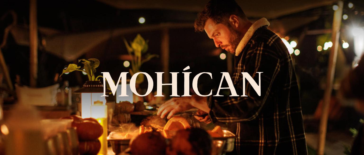
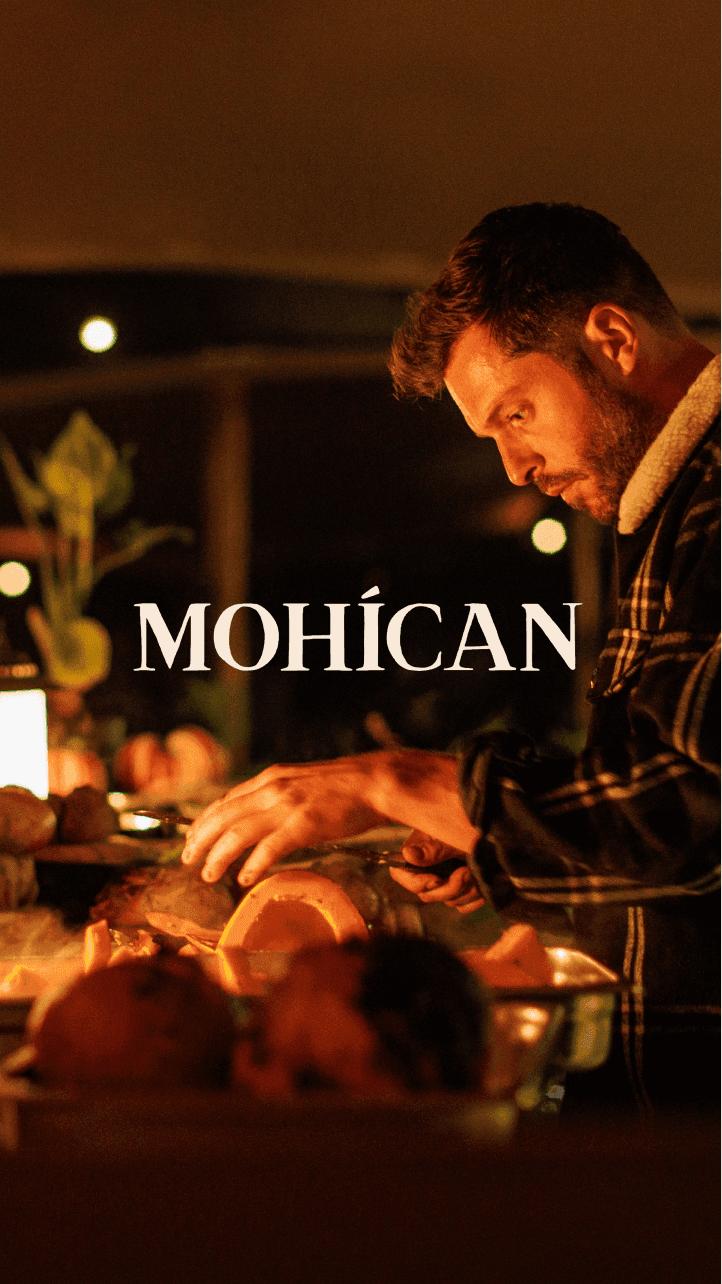
Mohícan offers visitors a unique dining experience in the middle of nature. An exclusive culinary spectacle that deserves a strong branding.
The logo
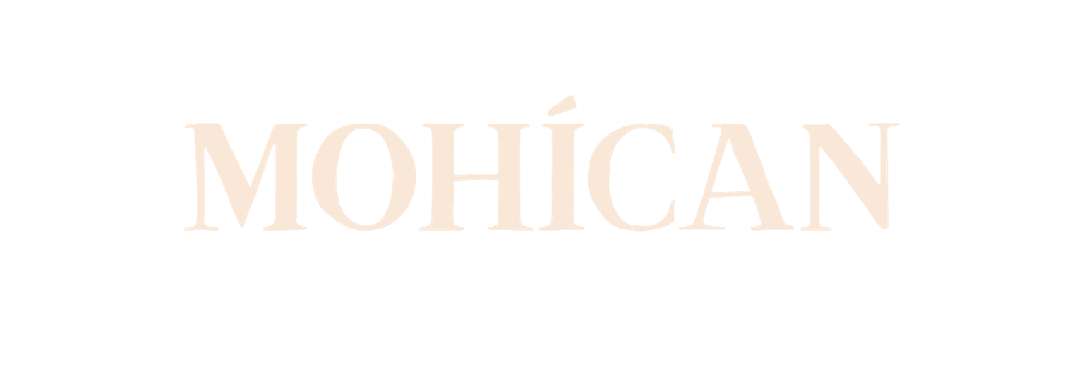
Mohícan is all about nature and fire. Minimalism or sharp corners just wouldn’t do the brand justice. We took inspiration from nature’s imperfect shapes and the mirage effect you get above fire to handcraft a font for Mohícan’s logo.
- Deliverables
- Branding
Website
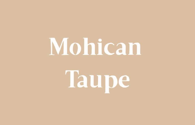
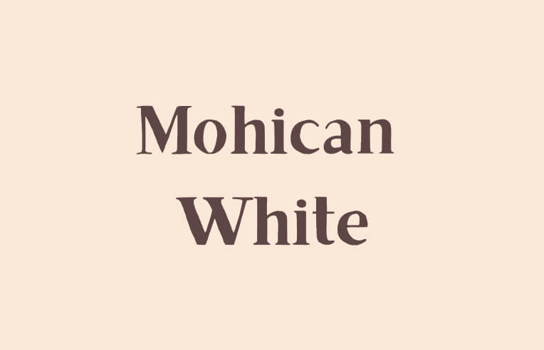
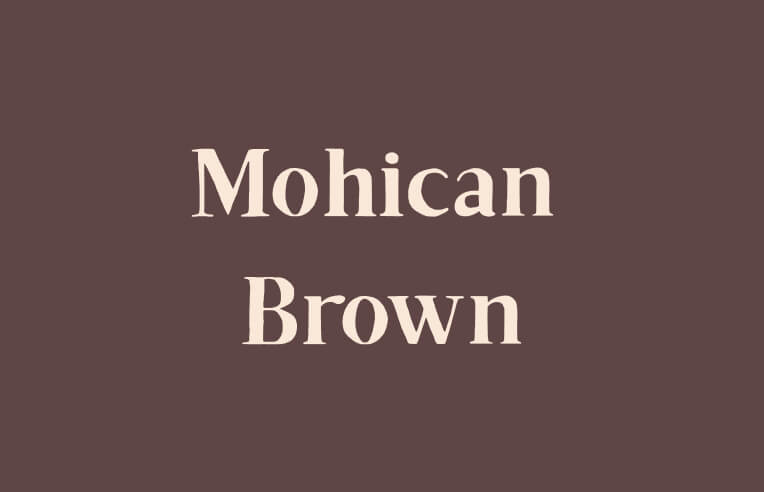
The palette
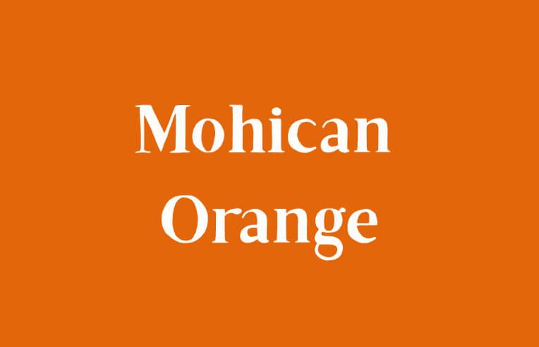
During a dinner at Mohícan, fire takes centre stage as chefs prepare your food on open fires in the middle of the woods. We translated this into a warm orange and natural brown colour palette.
Find out more about the development
of the Mohícan website here.
To add to the overall visual experience, we also created elements that can be used on various platforms.
- Serie fonts to express quality and service
- Arrows that refer to the original Mohícan tribe
- Lines and spark-like shapes that represent the unpredictable shape of fire
Find out more about the development of the Mohican website here.
Ready to makemore impact?
Don't hesitate, we're happy to help.Leave your details or give us a call.