Taalunie: a social media facelift
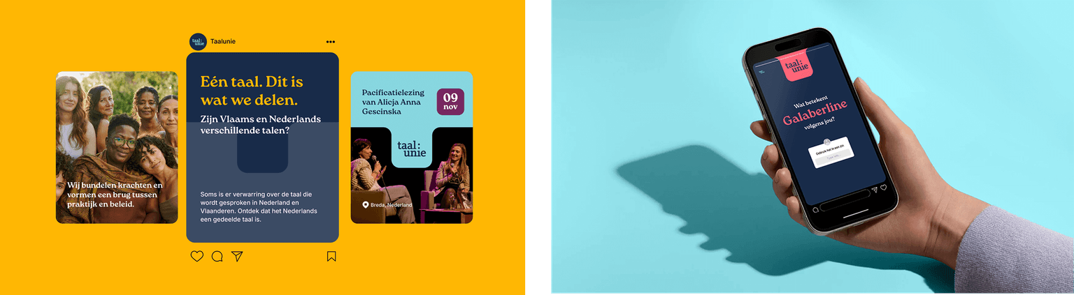
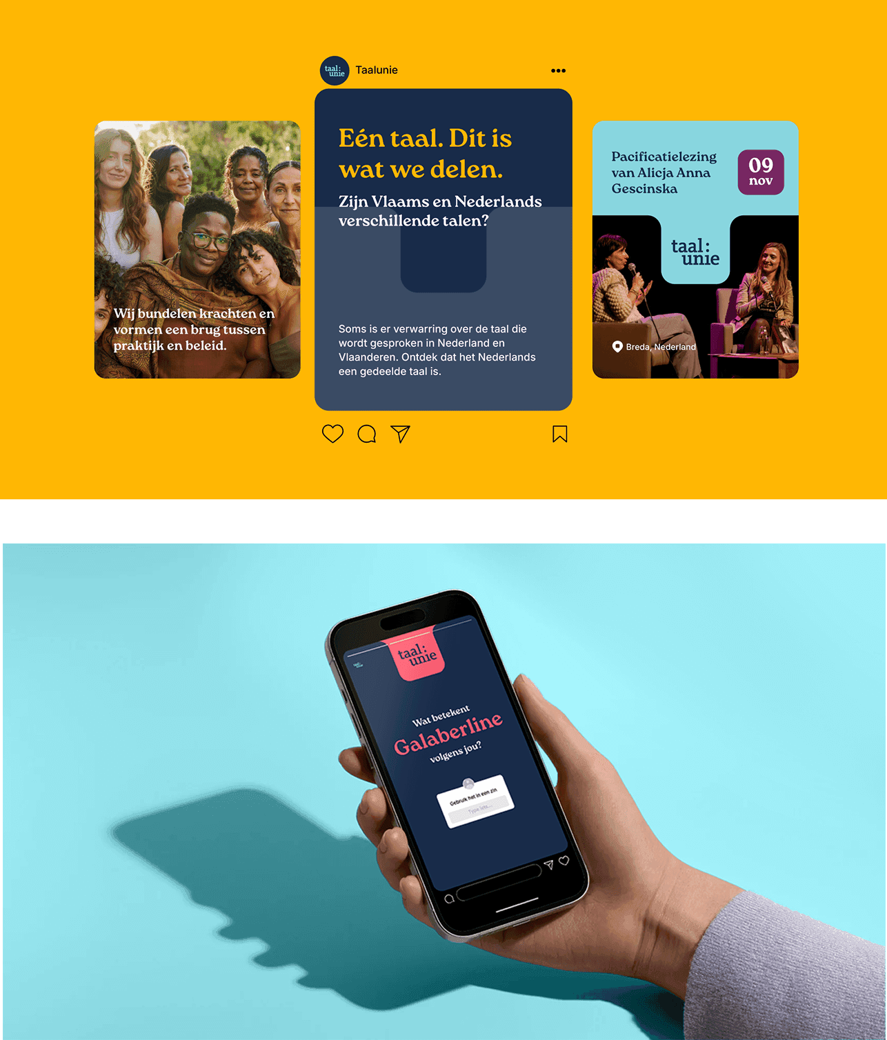
Correct usage of the Dutch language often seems hard to find on social media—something the Taalunie wants to change. We supported them in their Instagram debut with fresh social branding.
A fresh look
The Taalunie's main reason for launching an Instagram account was to reach younger audiences. To support this goal, we decided that the Taalunie's style also needed a younger look. We adapted the logo and proposed a fresh colour palette that brings variety and rhythm to the Taalunie's communication.
- Deliverables
- Visual identy
Typography
Photography
Design system
Brand guidelines
Content pillars & guidelines
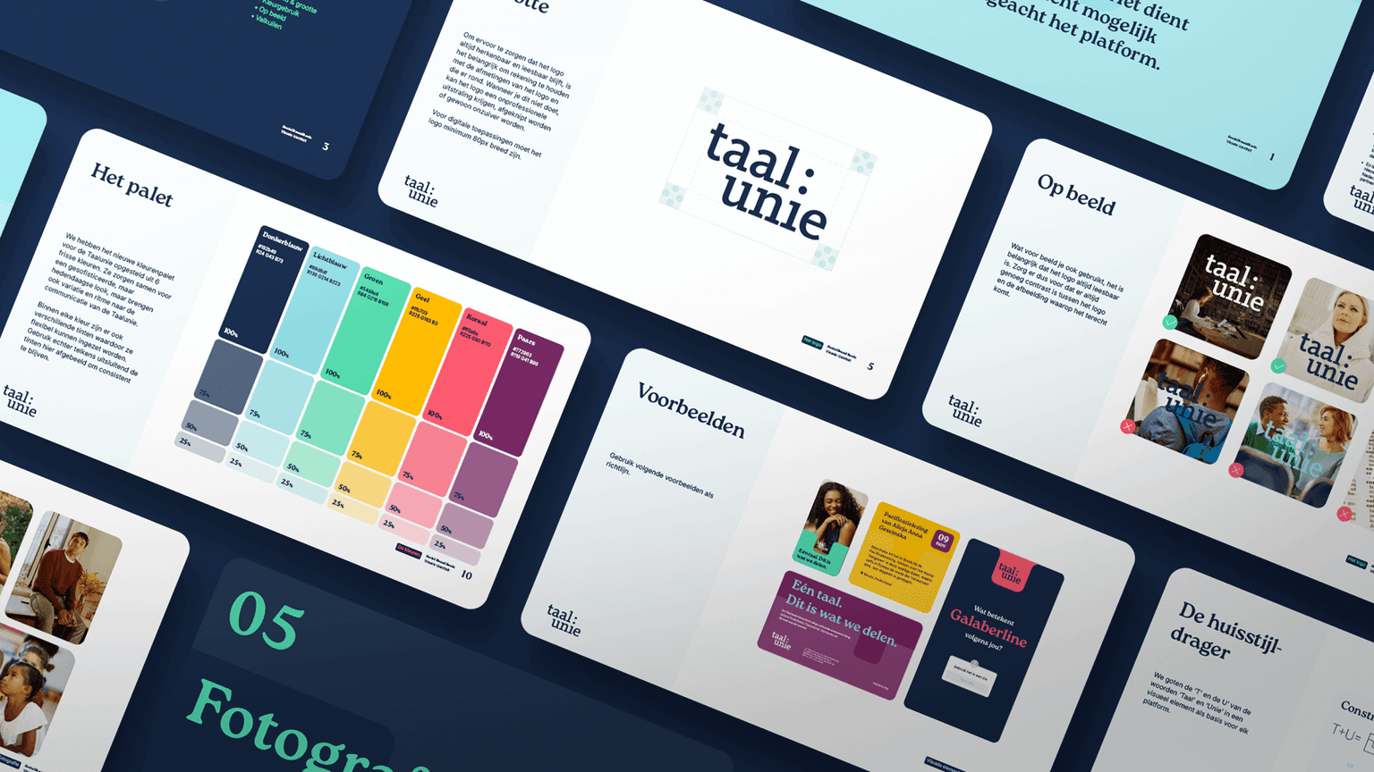
We drew up a brand book so the Taalunie could get to work on their own. In it, we collected guidelines for the visuals, which fonts to use and set up some defined content pillars. This also allowed them to work in a structured way with the content they want to post.
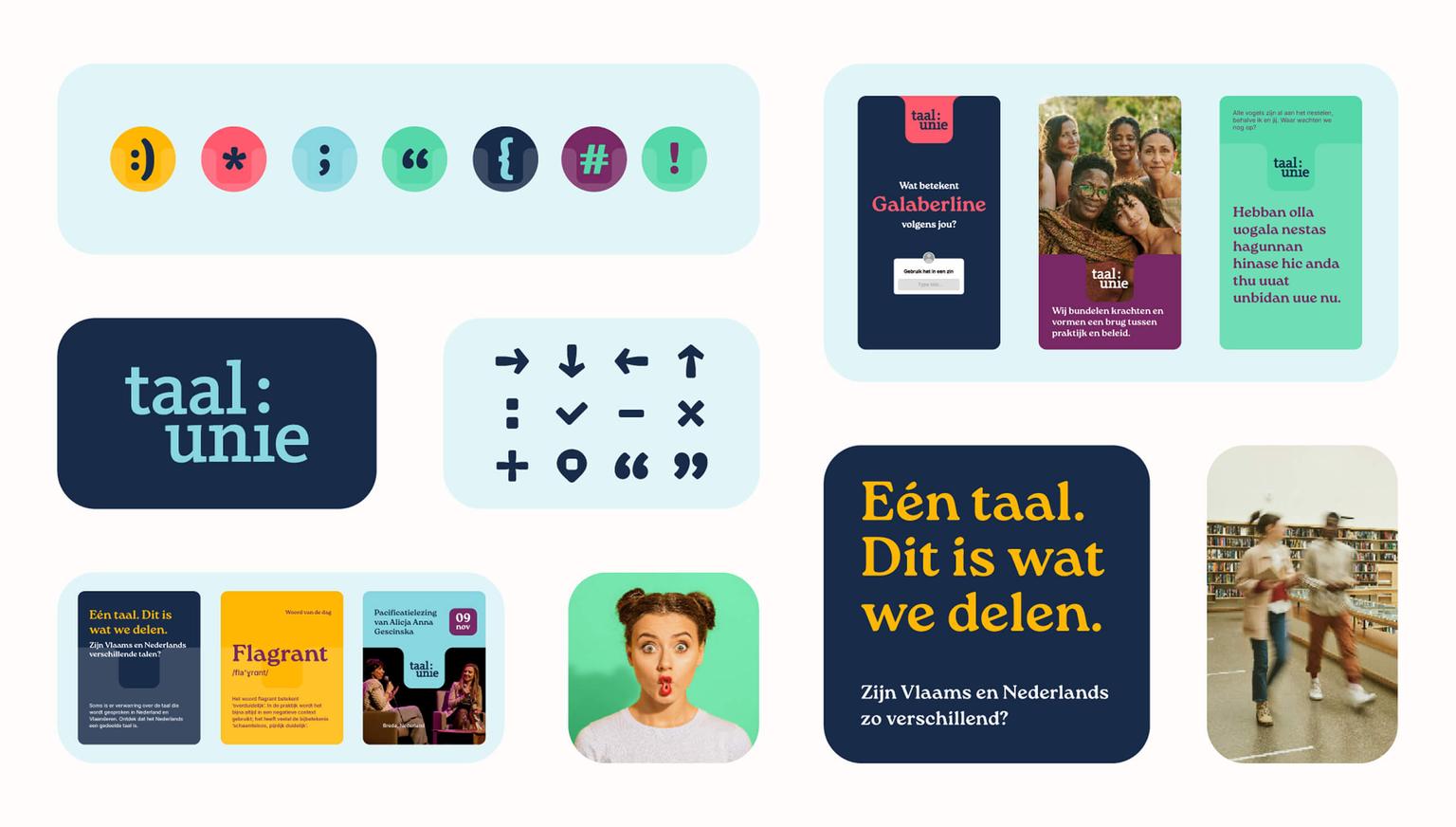
To get them off to a good start, we added
- Do’s and don’ts for the use of the logo on different carriers
- Colour combinations that also take readability into account
- Additional icons to reinforce the visual style
- Examples of corporate identity carriers in different formats to ensure consistency

Ready to makemore impact?
Don't hesitate, we're happy to help.Leave your details or give us a call.